3
Months
3
Designers
UI/UX Design Intern
Figma Sketch Jira
Hello Moto!
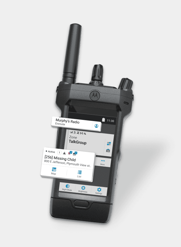
During my internship at Motorola as a UI/UX Designer, I delved into crafting interfaces and experiences for a smart radio device, used for aiding public safety personnel in their daily tasks. In this case study, I'll guide you through my process of designing within the constraints of a small top display and tackle tricky Figma prototyping challenges. Let's dive in and explore together!
What is a Top Display?
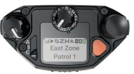
Top display is a visual interface at the top part of the APX NEXT radio device, that provides information such as channel status, battery life, signal strength, or other relevant details. Top display is considered as a shortcut to view the critical information without pulling out the radio when police officers are in public safety tasks. Picture above is the original top display of APX NEXT.
Why do we need to redesign it?
User Needs
Have quick access to key info from various apps in a glance, so that they can keep their hands free in tasks (from research team)
But, currently
The space is underutilized, displaying only symbols and key info, despite the need to showcase numerous apps
So, let's
Optimize information architecture and create new modalities to efficiently deliver important task-related information to users
03.IDEATE
Competitive Analysis
Given the top display on the Motorola APX Next radio is comparable in size to a watch, I drew inspiration from leading smartwatches in the market. Conducting a competitive analysis on devices like the Apple Watch and Samsung Watch. I gleaned valuable insights to inform and enhance the design of the top display.


Apple Watch
A concept from Human Interface Guidelines provided me with a great inspiration for displaying information in limited space based on context, which echos our users' needs:
Dynamic Widget: Utilizing automatically changing widget to display information based on different context.
Samsung Watch
Samsung Developer also introduced me with the navigation flows that is used in their design, which helps users to navigate information between levels.
Lateral Navigation: Navigating information on the paralleled level by swiping between individual screens.
Hierarchical Navigation: Tapping into deeper levels when content have multiple levels
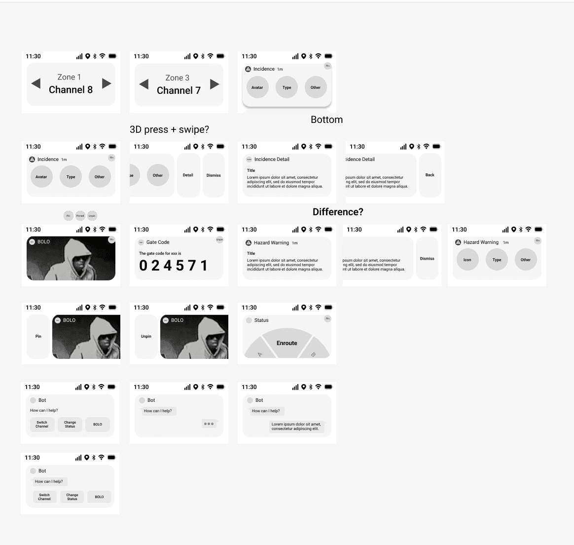
Sketchs & Wireframes
After gathering inspirations, my first step was to sketch my ideas on paper. I collaborated with my mentor to refine and narrow down the concepts, translating them into detailed wireframes.

Designing interactions
In the pursuit of optimizing information display within constrained space, determining the interaction became pivotal in top display design. Leveraging insights gained from widget design and navigation flow through competitive analysis, I decided to implement a bi-directional scrolling interaction.
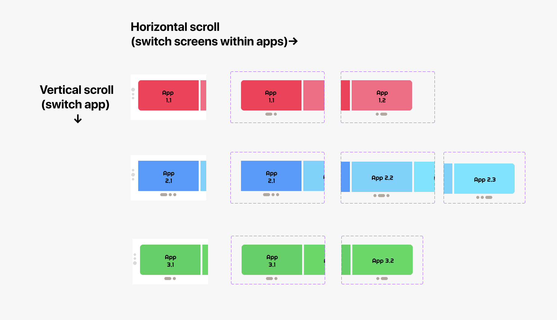
Vertical Scroll: switch between apps (lateral navigation)
Horizontal Swipe: facilitates screen changes within the same app to display different level of information (hierarchical navigation)
Distinct interactions: minimize the risk of mistake and operation effort when in fast-paced incident situations
Dynamic widget: only one widget displayed at a time, featuring the most relevant information and reduce users' cognitive effort
Challeneges & Tries
While the concept of bi-directional scrolling may appear straightforward, its implementation proved to be an unexpectedly complex process. Figma, unfortunately, does not inherently support bi-directional scrolling on a single object, which posed a significant challenge. To find a workaround, I searched many relevant tutorials, played around with components, created prototype logic charts to understand Figma's underlying logic, and discussed the issue with senior designers.

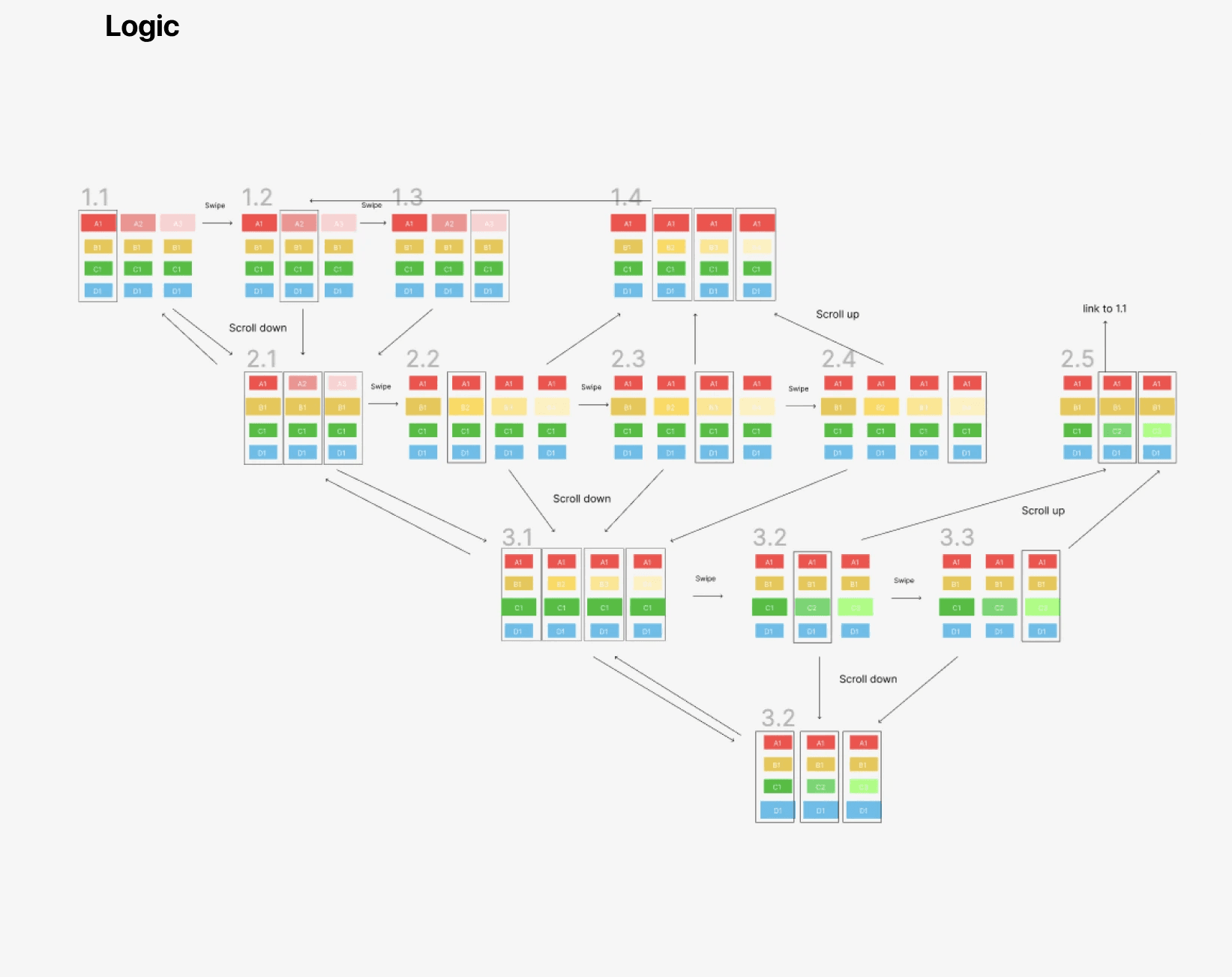

I was eventually able to leverage a strategic trick by grouping the elements into a horizontally scrollable component first, then grouping the horizontal components into a larger vertical scrollable component to make the desired bi-directional scrolling prototype happen.
Final prototype
After multiple iterations and team feedback, I developed the prototype below as a next-gen Top Display for Motorola's radio device, addressing the user need for quick access to information across apps.
New Modalities
Each app in the radio system can now have its succinct version of widget on the top display, giving users a shortcut to view information.
Progressive Disclosure
Reduces cognitive work load by dynamically displaying only one relevant widget according to the context, revealing layers of info after user take actions.
Visibility of Status
Providing a navigational scrolling bar on the left that uses icons to signify which app the user is in, making the system status available.
Information Snacking
Gives users compact information and updates in a glance to protect their focus and reduce their effort in public safety tasks.
What I learnt?
My biggest takeaway from this project is the realization that, in the realm of design, problems that may seem unsolvable at first can be overcome by dedicating time to understand the underlying logic and reasoning, on both the problem itself and prototyping level. This lesson has significantly strengthened my problem-solving and self-learning skills, which deepened my confidence in approaching complex tasks as a Designer in the future.